TUESDAY, 17 AUGUST 2021
It is rare to find a scientific paper without figures. In many ways they are the most important art of a paper, providing the evidence for claims in research papers and rendering concepts easily understood in reviews. But their importance is not confined to papers. Be it science textbooks,
infographics, news articles, patient information materials or even adverts, visualising science is key to communicating scientific ideas. As visual creatures, humans tend to find information in graphic form easier to comprehend. Yet visualising science is not straightforward — so it is often badly done.
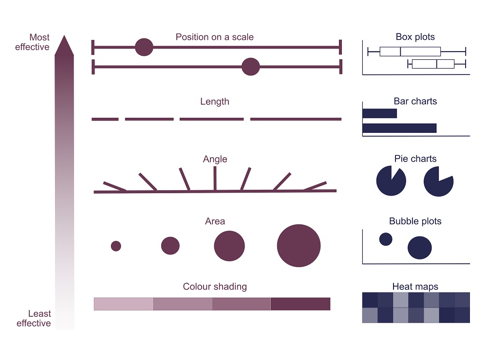
Firstly, there’s chart choice. In different types of graphs, different visual elements are used to compare data: position in box plots, length in bar charts, angle in pie charts, area in bubble plots, shading or colour saturation in heat maps, just to name a few. But not all visual elements are made equal to the human eye: studies of crowd-sourced assessments have shown that position and length are the most effective way to convey differences between data groups, as in bar charts. Differences are hardest to spot in heat maps, pie charts, and bubble plots. Large differences between groups are usually noticeable regardless, but subtle disparities may be missed — or hidden — if a less effective element is used.

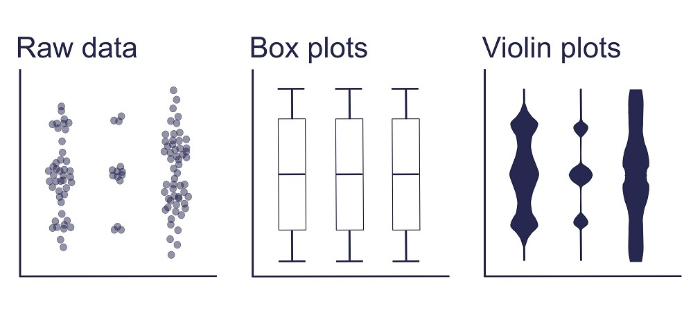
That doesn’t mean, however, that bar charts are always the solution. Chart choice should depend on data type and the pattern to be demonstrated, such as distribution, correlation, ranking, or change over time. Although continuous data are usually best represented by scatterplots and histograms, many published papers fall at this first hurdle. A 2015 survey by Tracey Weissburger at the Mayo Clinic in Minnesota found bar graphs representing continuous data in 85% of papers in top physiology journals. For continuous data, bar graphs hide sample sizes and data distributions — but they aren’t alone in this limitation. Summary graphs including box plots have the same drawbacks. The solution that’s increasingly advocated for is to show as much of the raw data as possible alongside the summary plot, which can be achieved with scatter or violin plots.

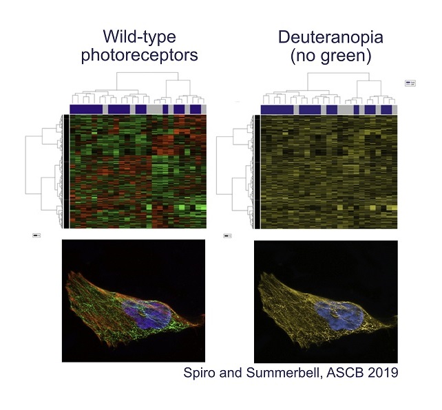
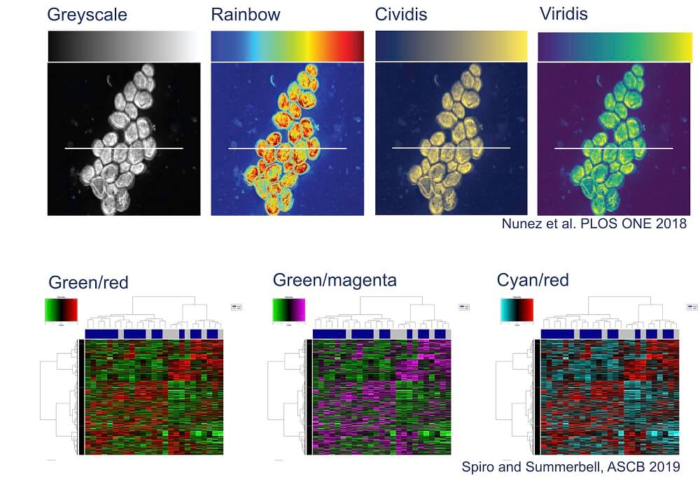
Colour is another problematic aspect of data visualisation. Even though colour coding is eye-catching and can provide another data dimension, human colour perception isn’t as straightforward as we tend to assume. Take, for example, the commonly used rainbow scale. This scale isn’t perceived evenly: some colour transitions appear gradual and others abrupt, stretching differences in the data out of proportion in the viewer’s mind. Plus, the middle of the rainbow is brightest instead of the end, so mid-points are mistakenly interpreted as the highest values. Compounding these issues, a rainbow scale loses meaning for people with colour-blindness (approximately 1 in 12 men and 1 in 200 women globally), as does the all-too-common red-green colour coding.

There are alternatives that display data more accurately and accessibly. Information about simple colour combinations that work for colour-blind vision, like magenta and cyan, can be easily found online such as in the American Society of Cell Biology colour accessibility guide. In the statistical software R, the ‘colorbrewer’ package has colour blind friendly palettes. As for scales, perceptually uniform gradients have been developed such as ‘viridis’ and ‘cividis’; these have been added to plotting software libraries in MATLAB and Python.

The need for better science visualisation goes beyond communicating findings to other scientists. Similar visualisation principles apply to creating graphics to engage broader audiences in science.
Despite an increasing amount of practical knowledge about what does and doesn’t work for data visualisation, change is slow. Often, many scientists are used to using a conventional set of data visualisation methods and simply aren’t aware of the problems with them. For example, Weissberg notes in Knowable Magazine that bar graphs are generally accepted for showing continuous data in biomedical sciences. Even when scientists are aware of the issues with their figures, there is little incentive to spend precious time identifying the better alternatives.
It isn’t fair or realistic to expect individual researchers to be solely responsible for improving data visualisation. Dr Sean O'Donoghue, at the Garvan Institute of Medical Research, suggests that software tools and journal standards could be more effective for driving change. O’Donoghue chairs VIZBI, an annual international conference dedicated to visualising biological data. He points out that incorporating better tools as the default in plotting software naturally leads to their higher uptake; this has been done with some colour schemes. Similarly, journal submission guidelines can have widespread impact. There is some progress in this area too. Nature Methods adapted a column on figures advice into submission guidelines including avoidance of red/green colour combinations. Other journals including PLoS Biology and eLife have added policies about using bar graphs.
An important area where little has changed is education. Most scientists receive little-to-no training in data visualisation, with their only exposure often being through statistics courses. Of course, postgraduate students may receive advice from peers and mentors on figure design, but this learning route is susceptible to perpetuating bad practice rather than applying best principles. To remedy this, institutions could make scientific visualisation classes a core component of science students’ education.
The need for better education on science visualisation goes beyond effectively communicating research findings. In the 2018 Annual Review of Biomedical Data Science, O’Donoghue argued that data visualisation also plays a key role in analysis and discovery. Visualisation is a crucial method for finding patterns in complex, high-dimensional data-sets. Therefore, bad data visualisation can mean missing out on new findings.
More insidiously, bad data visualisation allows the researcher’s bias to creep into data analysis. As we have seen, it is easy to mis-represent patterns in data simply through the choice of charts and visual elements, affecting both analysis and communication. It needn’t be overtly intentional — if you see what you expect with your default plot, you might not think to check another. Or vice-versa, if a chart brings out an inconvenient pattern that you believe is irrelevant, you might then investigate alternatives. This susceptibility to bias makes the need for an educational grounding in effective, responsible, and ethical data visualisation all the more pressing.
Scientists depend on data visualisation at all stages of the research process, but currently it falls short of its full potential. Better science visualisation is possible: innovative tools exist and new approaches are constantly being developed. It’s time to step up the standards and empower all researchers to revolutionise their data visualisation.
Bethan Clark is a first year PhD student at King’s College studying evolution and development at the Department of Zoology. Artwork by Bethan Clark.
Featured image from https://learnpython.com/blog/11-tips-for-building-a-strong-data-science-portfolio-with-python/
